It’s not that often I get really excited about a font. I get excited, just not really excited. But FatFonts is really quite exciting. FatFonts is a graphical technique conceived and developed by Miguel Nacenta, Uta Hinrichs, and Sheelagh Carpendale.
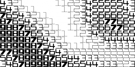
Essentially, all it does is reflect how high a number is by making the number look darker. I.e. 1 is light, 9 is dark. Why is this interesting? Well consider the image above, looks a bit like me but it is made out of a data grid of the colour values in an image. The image you see is both the data and an image. Great for infographics, topographical data, mapping and all sorts of information-based visual data.
The example above was a very quick Flash BitmapData hack. Loading an image, sampling the pixels for their colour values and doing some basic maths to downsample each colour to the 1-9 range. If anyone wants, I can get an online version running so you can load your own images. There’s a bit of an issue with absolute black in this example, but it only took 25 minutes and proves the point well enough.
Here’s a closer example with a range of 1-9 for each character…

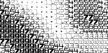
And here’s the same thing with a range of 1-99

The fonts are available under the creative commons licence so head over to Fatfonts and go play!


Add comment